Wrapper
.wrapper | .border
           .bg-color
This section raw HTML has no indentation because it's easier this way, trust.
Expandables
Id of input and label must be same, put anything there.
Make sure to not have object with fixed height or else your layout will be destroyed (empty space on bottom). Fixable by adding "overflow: hidden" on its parent.
<section class="expandable slow">
  <input id="IDHERE_sys" type="checkbox" class="expandable-control">
  <label for="IDHERE_sys" class="expandable-title">
    <div class="expandable-title-icon"></div>
    <p>HEADER Title</p>
  </label>
  <div class="expandable-content">
    <div>
      <p>Content Here</p>
    </div>
  </div>
</section>
.expandable | .slow - slow toggle speed
              .fast - fast toggle speed

Add empty tag like div with this class if there's image needed to be lazy loaded.
  .chrome-lazyload-enforcer
Alternative Ver.
Details-Summary Version
Very simple but has no closing animation and when the height doesn't overflow, the transition stop abruptly.
Possible because when details is opened, they get [open=""] tag which we apply style there!
Add style="--max-height: xpx;" to adjust max-height in-html
lorem
lorem
lorem
lorem
lorem
lorem
lorem
lorem
lorem
<details>
    <summary>TITLE</summary>
    <div>
      CONTENT
    </div>
  </details>
details | style="--max-height: 300px" - adjust max height manually
Gallery Lists
This section is WIP!
Kinda hard to translate into modular, see gallery.html for full example.
Caption here


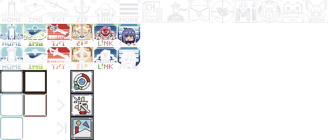

Codeblocks
Stylish code blocks using pre and code tags, not so stylish in the raw html... The most important is that the pre and code tags doesnt have indentation. The current iteration uses empty whitespace for top padding because having pre-code-text in a single line is too much for my own sanity.
<div class="codeblock-full"><pre><code>
Text Here with no indentation
</code></pre></div>
.codeblock-full | style="--title:'TITLE_HERE'"
  You can
          do this
                  without too much
                                   trouble.
                                            Overflow will just scrollbar, so add break manually! -----------------------------------------
Alternative / Old
Very simple blockquote tag that is styled so you can put it quick and easy. Overflow will wrap itself so it can get nasty for long text.
Tooltips
Usable inline text, click on this Tooltip content Tooltip to expand its content
<span class="tooltip" tabindex="0"><span class="tooltip-content">
  Tooltip content
</span><span>Tooltip Title</span></span>
.tooltip | .slow       - transition speed
           .compact    - similar to default but will align to the left title
           .wide       - force full wide
           .click-only - disable hover, so show on click only

On desktop, adjust max-width in .tooltip-content if need be. Depending on its position, there's a certain max value.
Alternate
A dead simple alternativeI'm a span of text that simply unhides element next to it. In case you missed it, hover the "alternative" text (the first one).
<span class="tooltip-alt">Tooltip Parent</span><span class="tooltip-alt-content">Tooltip Content</span>
Avatar Picture
Mobile view does not float, all is centered.

Left

Right

Default
Default
<div class="headshot">
  <img src="/img/illith--px.png" alt="">
  <p class="headshot__name">Default</p>
</div>
The name is optional. Use float if need to be stacked, be warned it will overlap with other container outside if there's not enough content below it. Fixable by adding overflow:hidden on parent container
.headshot--float-left    - make it float left so you can fill content on the empty space beside it
.headshot--float-right   -
.headshot--pos-first     - modify margin, mainly for float, use on first object in the container
.headshot--pos-middle    -                                  use in-between objects in the container
Empty Wrapper